
Designing a Vibrant Display Board for St. Teresa's RC Primary School
- Jun 21, 2023
- 3 min read
Updated: Jul 4, 2024
Introduction (School Display Board Design):
Creating an engaging and visually appealing display board can be a rewarding project, especially when it showcases the incredible work of students. Recently, I had the opportunity to design a display board for St. Teresa's RC Primary School, and I'd like to share my creative process with you. From receiving the initial brief to adding the final touches, every step was carefully considered to ensure an eye-catching and informative display.
Understanding the Brief:
The first step in any design project is understanding the requirements and expectations. When I was assigned the task of designing the display board, I had a detailed discussion with Ian (Primary School Teacher) to clarify the purpose, content, and desired theme. This collaboration was essential to ensure that the result would align with the school's vision.

Rough Layout Sketch:
With the brief in mind, I proceeded to create a rough layout sketch. Working closely with Ian, we discussed the placement of various elements and the overall composition. This sketch served as a blueprint for the design, allowing us to visualize the result before diving into the details.

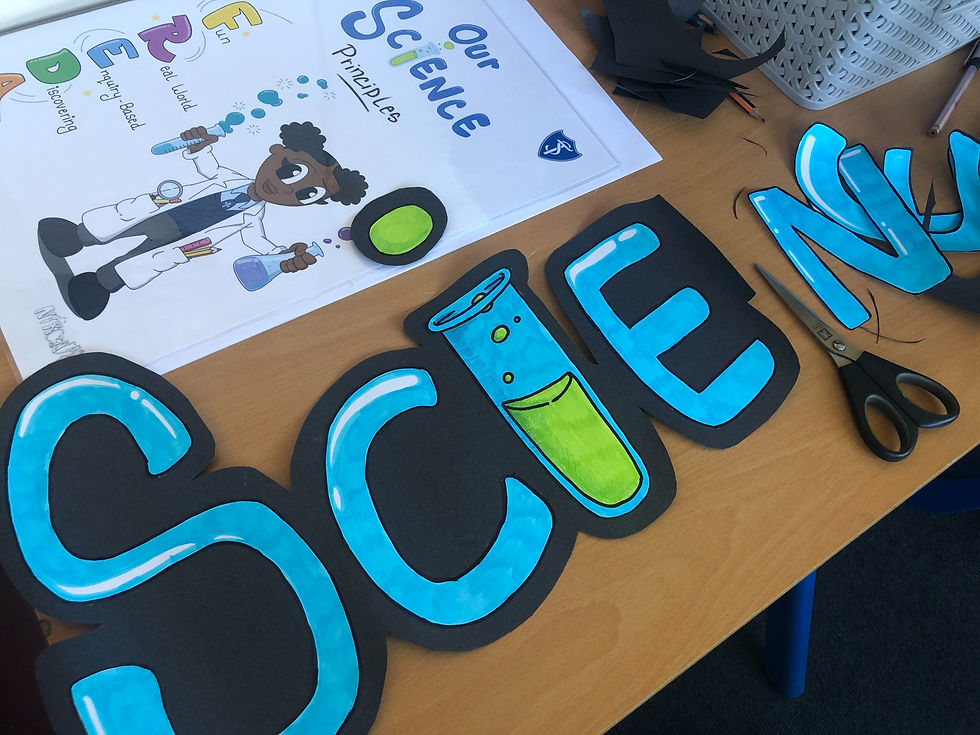
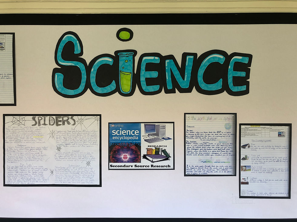
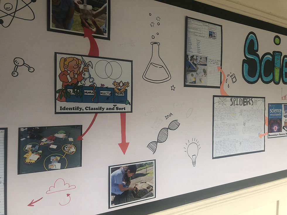
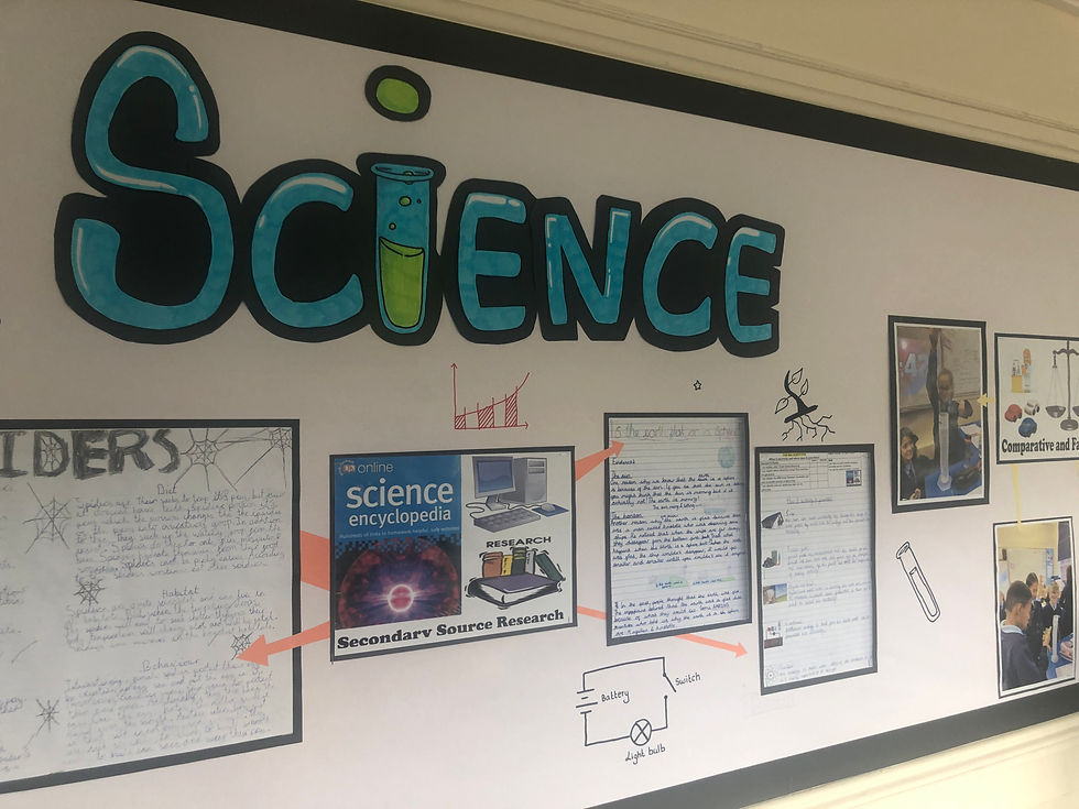
Handcrafted Display Header:
To make the display board truly unique, I decided to design a custom header font. I began by hand drawing each letter of the header on separate A4 sheets of paper. This process allowed me to infuse the font with personality and creativity. Once the letters were complete, I carefully coloured them in and cut them out. To make the header stand out, I backed it on black paper, creating a striking contrast.
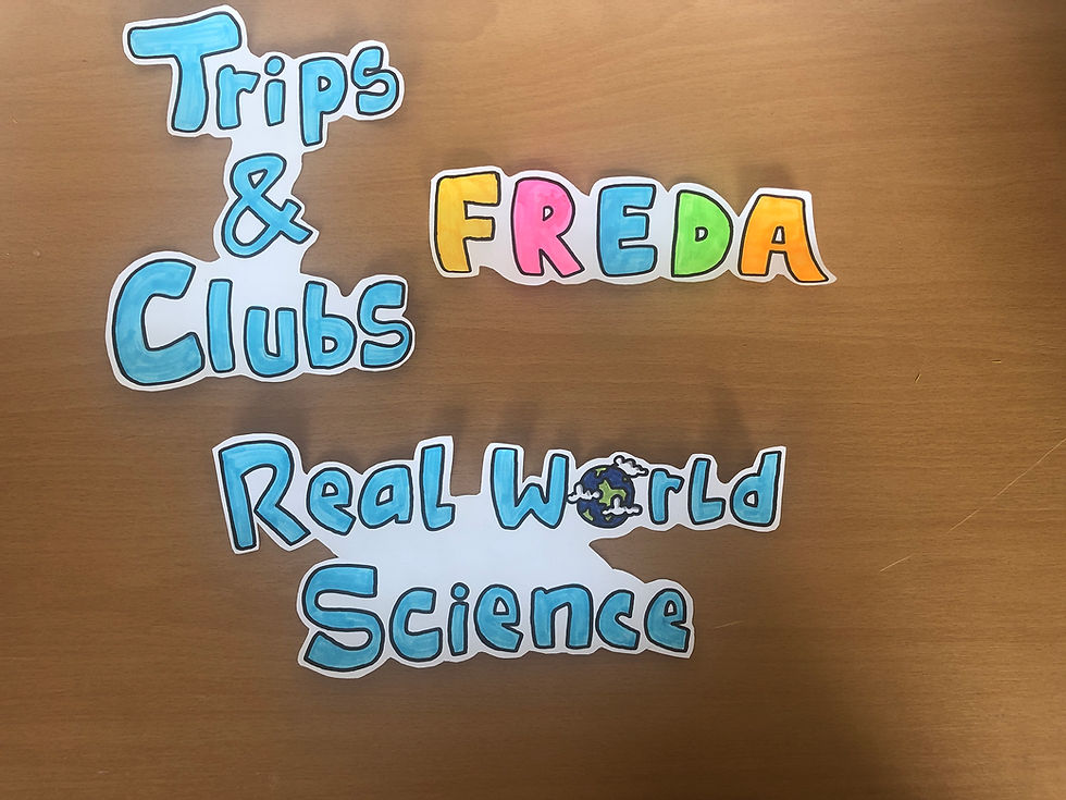
Drawing Sub-Headings:
To further enhance the visual hierarchy and organization of the display board, I drew sub-headings that complemented the overall theme. These sub-headings were carefully positioned to guide the viewers' attention and provide clarity. The hand-drawn elements added a personal touch and a sense of craftsmanship to the display.
Previewing with Children's Work:
Before finalizing the design, it was essential to see how the display would look with the actual student work. To achieve this, I used blue tack to temporarily attach the children's work to the newly backed display board. This preview allowed us to evaluate the visual impact and make any necessary adjustments before committing to a permanent display.

Stapling and Securing the Pictures:
Once we were satisfied with the arrangement of the children's work, it was time to secure them to the display board. Using a stapler, I carefully attached each picture, ensuring they were aligned and evenly spaced. This step required precision and attention to detail to maintain the overall aesthetic appeal.

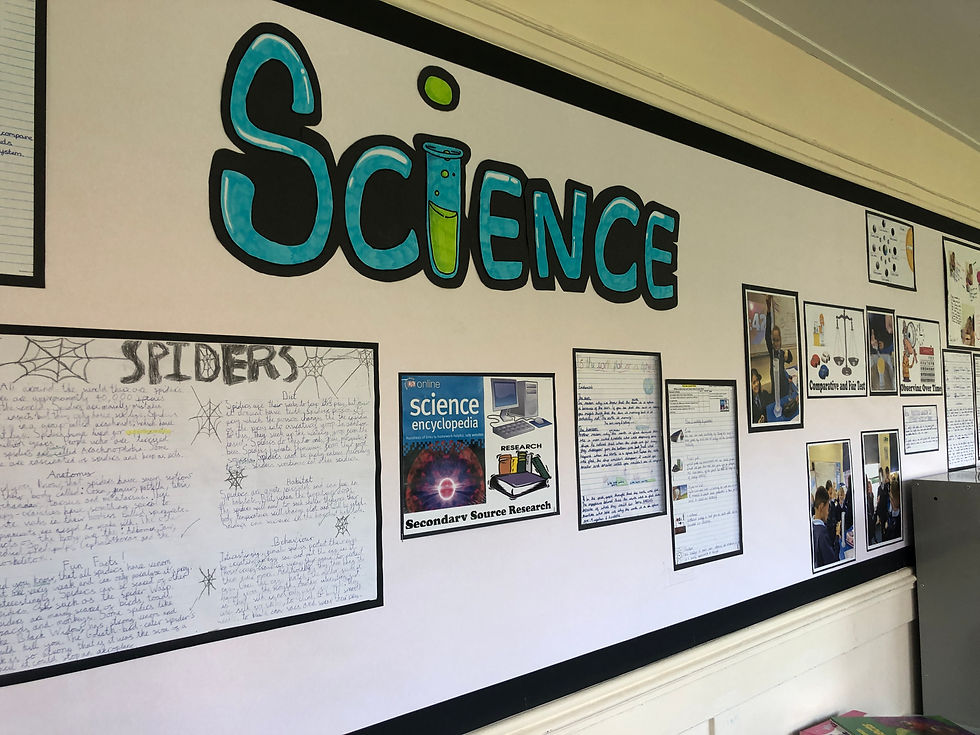
Adding Arrows and Key Stage 1 Illustrations:
To enhance the display further, I decided to incorporate arrows to provide visual cues and guide the viewers through the content. Additionally, I drew Key Stage 1 science-related images directly onto the display board, creating a whiteboard-like feel. These illustrations not only added a playful touch but also made the board more interactive and engaging for the students.

Conclusion:
Designing a display board for St. Teresa's RC Primary School was an exciting and fulfilling experience. By following a collaborative approach, creating custom hand-drawn elements, and paying attention to detail, we were able to bring the display board to life. The vibrant colours, personalized font, and thoughtfully arranged student work will undoubtedly captivate the attention of both students and visitors alike, fostering a sense of pride and accomplishment within the school community.


Comments